

WHATABURGER: REBRAND
For this university project, I created a brand refresh for a globally known brand. This choice wasn't accidental; I have always had a personal dilemma with Whataburger's current mark, feeling it could be so much more. While I understand and respect its historical influence, the current mark lacks functionality and can be visually difficult to look at.
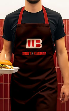
To address this, I took a contemporary take on the current Whataburger mark to make it feel modern, bold, and new. The new mark is clean and simple, utilizing geometric lines that offer limitless creative expression. I switched the traditional orange for a strong red, accented by maroons and creams. To complement this, the typeface features strong, boxy letterforms that remain in that same geometric category.







DRAFTS
Here are some of the contenders that didn't make the cut. Throughout this process, I explored multiple moods, vibes, shapes, and styles before ultimately landing on #5.
